The relationship between pixels, inches, and DPI defines clarity, sharpness, and usability in digital display technology. Accurate conversions across devices ensure professional results in web design, printing, engineering, and user experience applications.
Screen Resolution Converter — px ↔ inches ↔ DPI
How do I use this converter?
Which DPI should I use?
Formulas used
Why results differ from CSS values?
Why Screen Resolution Conversion Matters
- Digital design: Designers must adapt graphics for displays ranging from smartphones to 4K monitors.
- Print preparation: Printers require conversions between pixels and inches at specific DPI for sharp outputs.
- Hardware calibration: Engineers rely on precise conversions to ensure screens meet ergonomic and technical standards.
- User experience (UX): Mismatched resolution or scaling can cause blurred images and poor readability.
Accurate conversion between px, inches, and DPI is not optional—it is essential for professional workflows.
Core Formulas for Screen Resolution Conversion
The three variables—pixels (px), inches, and DPI (dots per inch)—are mathematically related. Below are the key formulas:
- Pixels to Inches:

- Pixels (px): The count of discrete picture elements.
- DPI (dots per inch): Number of pixels that fit into one inch on the display/print medium.
- Inches: Physical length in real-world units.
- Inches to Pixels:

- Used to calculate the required pixel dimensions for print or display.
- DPI Calculation:
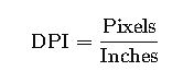
- Critical for determining sharpness or verifying screen density.
Notes on Variables and Typical Values
- Pixels: Common widths range from 640 px (legacy screens) to 7680 px (8K UHD).
- Inches: Typical display diagonals: 13.3″, 15.6″, 24″, 27″, 32″.
- DPI (PPI in digital displays):
- Low-density: ~72 DPI (older monitors, web baseline).
- Medium-density: 96–120 DPI (common laptops/desktops).
- High-density: 200–400+ DPI (smartphones, Retina displays).
Extended Conversion Tables
Below are detailed conversion tables with common values for designers, engineers, and print professionals.
Table 1: Pixels to Inches at Common DPI Settings
| Pixels (px) | 72 DPI | 96 DPI | 150 DPI | 300 DPI | 600 DPI |
|---|---|---|---|---|---|
| 100 px | 1.39 in | 1.04 in | 0.67 in | 0.33 in | 0.17 in |
| 500 px | 6.94 in | 5.21 in | 3.33 in | 1.67 in | 0.83 in |
| 1000 px | 13.89 in | 10.42 in | 6.67 in | 3.33 in | 1.67 in |
| 2000 px | 27.78 in | 20.83 in | 13.33 in | 6.67 in | 3.33 in |
| 4000 px | 55.56 in | 41.67 in | 26.67 in | 13.33 in | 6.67 in |
Table 2: Inches to Pixels at Common DPI Settings
| Inches | 72 DPI | 96 DPI | 150 DPI | 300 DPI | 600 DPI |
|---|---|---|---|---|---|
| 1 in | 72 px | 96 px | 150 px | 300 px | 600 px |
| 5 in | 360 px | 480 px | 750 px | 1500 px | 3000 px |
| 10 in | 720 px | 960 px | 1500 px | 3000 px | 6000 px |
| 20 in | 1440 px | 1920 px | 3000 px | 6000 px | 12000 px |
| 40 in | 2880 px | 3840 px | 6000 px | 12000 px | 24000 px |
Table 3: Diagonal Screen Size vs Resolution and DPI
| Resolution | Common Diagonal | Pixels (Width × Height) | Approx. DPI |
|---|---|---|---|
| HD (720p) | 15.6″ | 1366 × 768 | ~100 DPI |
| FHD (1080p) | 24″ | 1920 × 1080 | ~92 DPI |
| QHD (1440p) | 27″ | 2560 × 1440 | ~109 DPI |
| 4K UHD | 27″ | 3840 × 2160 | ~163 DPI |
| 8K UHD | 32″ | 7680 × 4320 | ~275 DPI |
Real-World Applications
Case Study 1: Preparing Graphics for Professional Printing
Scenario:
A designer prepares a poster measuring 20 × 30 inches for offset printing at 300 DPI.
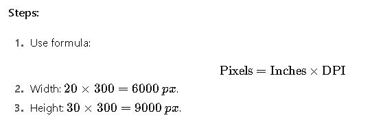
Result:
The design must be prepared at 6000 × 9000 px for sharp print quality.
Failing to meet this resolution would cause visible pixelation in the final output.
Case Study 2: Screen DPI Calibration for UX Testing
Scenario:
An engineer evaluates a 15.6″ laptop screen with a resolution of 1920 × 1080 px.
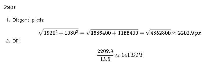
Result:
The laptop has 141 DPI, higher than the 96-DPI baseline. This explains why text may appear smaller at default scaling, requiring OS scaling adjustments (e.g., 125% in Windows).
Additional Technical Insights
- PPI vs DPI: Technically, screens use PPI (pixels per inch), while printing uses DPI (dots per inch). In practice, they are often used interchangeably.
- Scaling in Operating Systems: Windows and macOS adjust UI scaling automatically for high-DPI displays to ensure readability.
- Industry Standards:
- Web baseline: 96 DPI (W3C recommendation).
- Print standard: 300 DPI for professional output.
- Mobile devices: Often exceed 300–400 PPI for Retina-class sharpness.
Device Categories and Typical DPI Ranges
Different devices adopt specific pixel densities depending on their use case, cost, and ergonomic requirements. Understanding these ranges allows professionals to predict scaling behavior and design accordingly.
Desktop Monitors
- Entry-level monitors (17–19″) usually range between 85 and 100 DPI.
- Mid-range office monitors (22–24″) with Full HD resolution typically fall between 90 and 100 DPI.
- High-end professional monitors (27–32″) with QHD or 4K resolution often achieve between 120 and 160 DPI.
- Specialized monitors (medical, CAD, color grading) may reach densities beyond 200 DPI for precise rendering.
Laptops
- Budget laptops often feature 1366×768 resolution on 14–15.6″ panels, leading to around 100–110 DPI.
- Premium ultrabooks may incorporate Full HD on 13.3″ screens, reaching 160 DPI.
- High-performance laptops with 4K panels on 15.6″ screens push densities close to 280 DPI.
Smartphones
- Low-end smartphones once shipped with 150–200 DPI, but this is now rare.
- Mainstream smartphones commonly offer between 300 and 400 DPI, which already exceeds the limit of human eye detection at normal viewing distances.
- Flagship models may exceed 500 DPI, ensuring extremely crisp visuals, especially for VR or AR usage.
Tablets
- Standard tablets typically hover around 250–300 DPI.
- High-end tablets such as iPad Pro models provide densities near 260–320 DPI, optimized for digital art and professional tasks.
Printing Devices
- Basic inkjet printers start around 300 DPI, sufficient for general home printing.
- Photo printers usually support 600–1200 DPI, offering excellent detail for images.
- Commercial offset printing may use effective outputs equivalent to 2400 DPI or higher.
Extended Conversion Reference Table
Below is a table designed for practical application, showing pixel dimensions for common print sizes at industry-standard resolutions. This type of reference is widely used by designers and engineers.
Table 4: Common Print Sizes and Required Pixel Dimensions
| Print Size (inches) | 72 DPI | 96 DPI | 150 DPI | 300 DPI | 600 DPI |
|---|---|---|---|---|---|
| 4 × 6 (photo) | 288 × 432 | 384 × 576 | 600 × 900 | 1200 × 1800 | 2400 × 3600 |
| 5 × 7 (photo) | 360 × 504 | 480 × 672 | 750 × 1050 | 1500 × 2100 | 3000 × 4200 |
| 8.5 × 11 (letter) | 612 × 792 | 816 × 1056 | 1275 × 1650 | 2550 × 3300 | 5100 × 6600 |
| 11 × 17 (tabloid) | 792 × 1224 | 1056 × 1632 | 1650 × 2550 | 3300 × 5100 | 6600 × 10200 |
| 24 × 36 (poster) | 1728 × 2592 | 2304 × 3456 | 3600 × 5400 | 7200 × 10800 | 14400 × 21600 |
Application in Web and Graphic Design
When preparing assets for digital or print projects, resolution choices directly impact both quality and file size.
Web Graphics
- Baseline recommendation: 72 or 96 DPI, optimized for screen rendering.
- High-density displays: Designers often prepare assets at 2× or 3× the base resolution, ensuring sharpness on Retina or 4K displays.
- Optimization trade-off: Larger pixel counts create heavier file sizes, which negatively affect web vitals such as loading speed and SEO ranking.
Print Media
- Posters, brochures, and business cards require at least 300 DPI for sharp reproduction.
- Billboards and large-format prints may work with 150 DPI because viewers stand farther away.
- Fine-art photography benefits from outputs at 600 DPI or more, revealing subtle detail.
Case Study 3: Web Image Optimization
Scenario:
A content creator prepares a website hero banner with a display width of 1920 pixels. The target is sharp rendering on both standard monitors (96 DPI baseline) and high-DPI Retina displays.
Process:
- For standard monitors: The required width remains 1920 pixels.
- For Retina and 4K devices: Assets are prepared at 3840 pixels wide (2×) to maintain crispness.
- Compression tools such as WebP or AVIF are used to reduce file size without quality loss.
Outcome:
The optimized image balances visual quality across devices while keeping load times fast, improving both user experience and SEO performance.
Case Study 4: Smartphone Display Development
Scenario:
An engineer is designing a 6.5-inch smartphone screen with a target resolution of 1440 × 3120 pixels.
Process:
- Calculate density relative to diagonal size.
- Compare the result with industry ranges for premium devices.
- Confirm whether this pixel density provides competitive sharpness.
Outcome:
The display achieves over 500 DPI, positioning it among flagship devices. This ensures superior clarity, especially critical for applications such as mobile VR, where pixels close to the eyes must be imperceptible.
Industry-Specific Uses
Medical Imaging
Radiologists use displays exceeding 500 DPI to interpret X-rays and MRIs with extreme accuracy. Pixel density directly influences the ability to detect anomalies in early stages.
Engineering and CAD
Large CAD drawings require ultra-high resolution monitors or plotters. Engineers cannot rely on low-DPI screens because small details would be invisible or inaccurate.
Publishing
Editors and typographers must ensure text readability. Even minor DPI mismatches can cause kerning issues, blurred typefaces, or mismatched proportions between digital and print layouts.
Common Mistakes and How to Avoid Them
- Confusing DPI with image quality alone: A low-quality image saved at 300 DPI does not magically become sharp. The pixel count must also be sufficient.
- Ignoring viewing distance: Billboards can use lower DPI because they are seen from afar, while handheld devices require much higher DPI.
- Mixing up PPI and DPI: PPI applies to screens, DPI applies to printers. Although often used interchangeably, professionals should differentiate in technical documents.
- Not accounting for scaling: High-density screens may shrink interface elements unless scaling adjustments are applied. Developers must test across multiple devices.
Extended Device DPI Reference
| Device Type | Typical Resolution | Common Screen Size | Approximate DPI |
|---|---|---|---|
| Budget laptop | 1366 × 768 | 15.6″ | ~100 |
| Mid-range laptop | 1920 × 1080 | 14″ | ~157 |
| Premium laptop | 3840 × 2160 | 15.6″ | ~282 |
| Mainstream smartphone | 2400 × 1080 | 6.1″ | ~400 |
| Flagship smartphone | 3200 × 1440 | 6.5″ | ~515 |
| Tablet (mid-range) | 2048 × 1536 | 9.7″ | ~264 |
| Tablet (high-end) | 2732 × 2048 | 12.9″ | ~264 |
| Monitor (office) | 1920 × 1080 | 24″ | ~92 |
| Monitor (gaming) | 2560 × 1440 | 27″ | ~109 |
| Monitor (professional) | 3840 × 2160 | 27″ | ~163 |
| 8K professional monitor | 7680 × 4320 | 32″ | ~275 |
Best Practices for Professionals
- For Designers: Always design at the highest expected resolution, then downscale as necessary for compatibility.
- For Engineers: Document exact PPI/DPI requirements in specifications to ensure interoperability across hardware.
- For Developers: Test applications on both standard and high-DPI devices to prevent scaling bugs.
- For Print Professionals: Verify both dimensions and pixel counts before finalizing artwork for press.
Key Takeaways
- Converting between pixels, inches, and DPI is fundamental for ensuring accuracy in design, engineering, and production.
- Higher DPI does not automatically mean higher quality; pixel dimensions and context matter equally.
- Different industries—from medical imaging to digital publishing—depend on precise resolution standards.
- Ignoring scaling or mismatched DPI can lead to usability issues, blurred graphics, and costly production errors.